I am a stamp collector. My wife Sue jokes that I took it up nearly 10 years ago because I wanted to confuse readers of my eventual obituary; "noted philatelist" could easily be confused with “noted philanthropist” she said, leading the world to assume I had a big heart instead of a large stamp collection. Tiny changes in a word can fool people sometimes, but the last people you’d expect to be fooled would be the philatelists. Stamp collectors have an appreciation for words, if only because the first actual stamped letters back in the 1840s contain such beautiful prose and meticulous handwriting as well. Sample a middle 19th century Valentine in my collection, for instance, written without the help of Hallmark, American Greetings or anyone else for that matter:
To my chosen one -
All pure, unspoiled by the world,
an offering full and free
my young heart's first affections
Joe - I now confide to thee.
Say will thou take the
gift I bring and guard it with
Thy love? And shall we then
by holier list, be registered above?
And say dear Joe, if
this should touch a chord
within thy breath,
will you not write to tell
me so and leave to time the rest.
Annie Annie
Sunnyside Charleston, Massachusetts
February 14, 1850
My oh my. That Annie sure had a thing going for Joe. Wonder if they ever “registered on that holier list”? Well, time winds on and Joe and Annie are hopefully in a better place, but the art of writing or at least spelling has not followed the same path, I’m afraid. I came to this conclusion several years ago after reading several memos written by one of our most senior credit analysts. XYZ Company, she wrote, would probably “loose” money in the 2nd fiscal quarter. Typo, I said to myself, but when other companies began “loosing” money over the ensuing years, I realized she needed a few writing and spelling lessons from dear Annie Annie. Turns out that this PIMCO crackerjack speller wasn’t alone though. Time and time again, other employees managed to “loose” one thing or another. And it seems they may have spread the disease. From Reuters News Wire October 16th: “Standard & Poor’s and Moody’s Investors Service said on Tuesday they could deal Argentina the blow of a default rating if bondholders “ loose” money with a planned domestic debt swap.” I could go on – I won’t – you get the point. We’ve “loost” more than the ability to write a pretty poem these past 150 years.
We’ve lost other things too, including a lot of money over the past 18 months or November 2001 Investment Outlook so, chasing a fantasy that investing in the stock market will allow us to retire early or pay for college for the kidlets, or whatever. “I believe in the markets” goes the current banter for an ad on CNBC and you can bet when this good looking, late 20ish actor says “markets” he’s clueless about the “bond” market. The man means “stocks” – good old American, meat and potatoes, get’em while they’re cheap, double-digit profits from here – stocks. This guy can’t spell, but he knows that when you invest in the stock market over a long period of time you really can’t “loose.” Well, I’m not so sure. As a matter of fact, I’m positive that you can “loose,” especially if expectations for future returns are unreasonably high. To prove my point, I’ve got three charts to show you which are much of what you’ll ever need to use to understand when the stock market is cheap and when it is too rich and what a reasonable expectation for future returns are – charts that esteemed investors such as Warren Buffet probably have filed in the back of their heads for a few decades at least. I’ll be quick, I’ll be brief, hopefully I’ll be convincing. The stock market is a two-way, not one-way street, that moves at a certain growth rate based on valuation, not inevitability .
Let me begin by admitting that stocks at any point in time are worth what anyone is willing to pay for them. NASDAQ 5000, Amazon.com and most recently Enron have proved that. It’s a beauty contest out there for short periods of time, and mass psychology can dominate common sense for longer than reasonable men and women care to admit. However, over long periods of time, stock prices are a function of two things: (1) corporate earnings, and (2) the price/earnings (PE) multiple investors are willing to pay for those earnings. Stock returns are a function of the stock price (1+2) and (3) the dividends you receive through time. That’s it – pure and simple folks; all you ever really needed to know about the stock market. Now I’m going to show you graphics for #s 1, 2 and 3 that will help you make up your mind and hopefully prevent you from “loosing” too much sleep or even money.
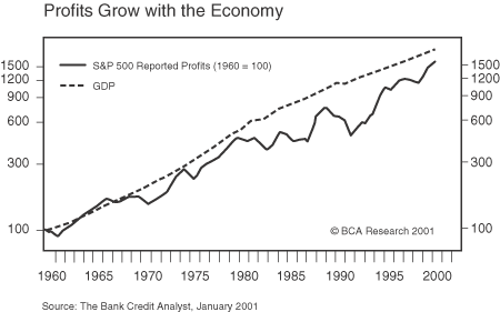
Chart 1 - shown below - a long-term history of corporate earnings versus GDP growth

Conclusion: corporate earnings grow close to but not quite at the rate of GDP growth over extended periods of time. The reason they fall a little short as pointed out in an excellent piece by Rob Arnott of First Quadrant is that a material part of economic growth is derived from new enterprises which are not yet investable – i.e. pre-IPO small businesses, and venture capital.
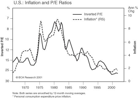
Chart 2 - a graphic displaying the compelling relationship of PE ratios (turned upside down here to show a positive correlation) and inflation:

Inflation goes up – as in the 70s and early 80s – PEs go down. Inflation comes down – as in the late 80s and 90s – PEs go up. Theorists would quarrel with the logic of this, claiming that companies can “pass through” inflationary costs when they need to and that “real” earnings growth should be unaffected by the inflation rate – if so, PEs should be more stable. Perhaps, but history suggests otherwise and indeed bond yields – which are directly impacted by inflation – are stock’s primary competitive investment alternative. If Treasury bonds are yielding 15% like they did in 1981, then stock PEs seem likely to be affected. They have been as you can see in Chart #2.
OK folks, this lesson in three charts is 2/3 done, and rather quickly like I promised. All you really need to know about whether stock prices are now too high, too low, or just about right, is to surmise from Chart 2 that PEs are just about where they should be in a 1-2% inflationary world. PEs are fairly valued, but importantly – not going much higher. They can’t, you see. Inflation isn’t going much lower than zero and if it does, we enter a deflationary spin zone which knocks earnings for a giant negative loop. So rest content that PEs of 25-30x are close to max bull market PEs. Granted, they’ve been much higher in Japan, but those are bear market PEs reflecting an economy in destructive deflation.
OK, if PEs are fairly valued – and not going higher, then stock market appreciation from here depends not on an expansion of PE multiples – which provided a good portion of the double-digit returns for the past 20 years – but on earnings growth (Chart 1) and dividends (Chart 3 to come).
Back to Chart 1 for a second. If earnings increase slightly less than nominal GDP, then the highest earnings growth investors can expect over an extended period of time in a low inflationary world is most probably 4-5%. That’s how fast nominal GDP growth will grow in a low inflationary world folks. Profits did manage to more than double nominal GDP growth in a disinflationary world between 1990 and 1999, but that was because of special factors (falling interest costs, declining effective tax rates) that are no more. Corporate profits will track or slightly trail nominal GDP growth in future years. 4-5% max growth per year: count on it.
Which brings us to Chart 3 - dividends.

Disparaged, neglected, relegated to the bleachers, nobody seemed to care about dividends up until about 6 months ago. Dividends were these icky things that Uncle Sam taxed at the highest marginal income tax rates. Far better to let the company use your money for future growth that you could shelter via capital gains. Except somewhere between theory and reality, investors discovered that a dividend in the hand was worth two phony earnings’ reports in the bush. You can’t spend what you don’t have. And so now investors are a little less concerned about tax rates and a little more concerned about cash in the till. “Show me the money” now means, “show me the dividends.”
Importantly, dear reader, observe where the last two primary secular bull markets began in terms of dividend yield levels. 7%+ in the late 1940s and 6%+ in 1982. Today? 1%+. What this tells you, to wrap up this trilogy pure and simple, is that if PEs don’t expand (Chart 2) and if earnings increase 4% or so in future years (Chart 1) and if you begin from a dividend yield of 1% (Chart 3) – then your return from stocks over the next decade is going to be 5% or so: 4% from earnings growth, 1% from dividends. The return could be even less if financial accidents, global risk reassessments due to war, or deflationary economics a la Japan come into play. Not double-digits: no doubles, no triples, no ten-baggers a la CISCO and Intel of yesteryear. 5%. Put that into your pipe and smoke it. Doesn’t taste so good does it? No matter – that’s what it’ll likely be and no amount of fancy reallocations between bonds and stocks is going to change it one bit. You’re not going to be as rich as you thought, which means more savings, less spending, and greater contributions to corporate pension plans in order to keep plans actuarially solvent.
As I’ve indicated in prior Outlooks, this is not really a commercial for bonds – it’s not a ploy to get you to give us all your money. After all, Treasury yields are in the 2-4% zone are they not? There are ways around these low bond yields but that’s a PIMCO story and a tale best told in a month or few months’ time. In the meantime, the message is this: A stock investor expecting double-digit returns over an extended number of future years is dreaming. A stock market investor born and bred in the late 90s and early 21st century was born to “loose,” if by “loosing” I mean failing to meet unreasonable expectations. New Age stock market investors must not only learn to spell, they must learn to contain their irrational exuberance. Greenspan had it right the first time – he just lost his way and his head like most of the rest of us. Exuberance is out, rationality is in, 5% or less should be the future return on stocks over an extended period of time. Count on it or be prepared to “loose.”
William H. Gross
Managing Director
